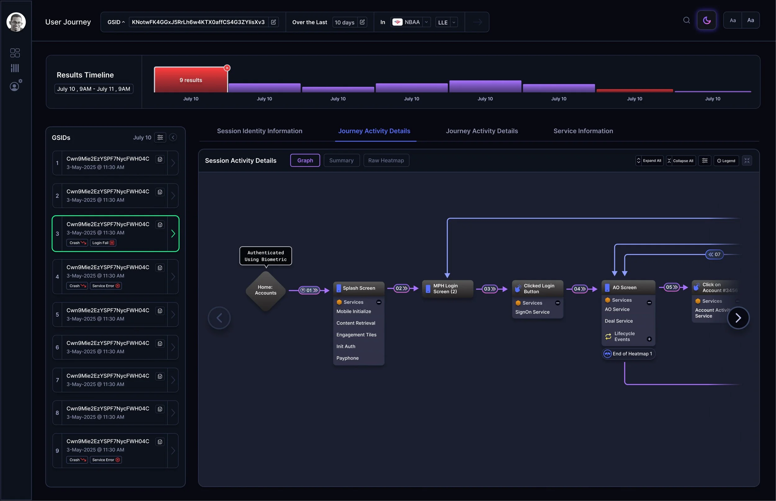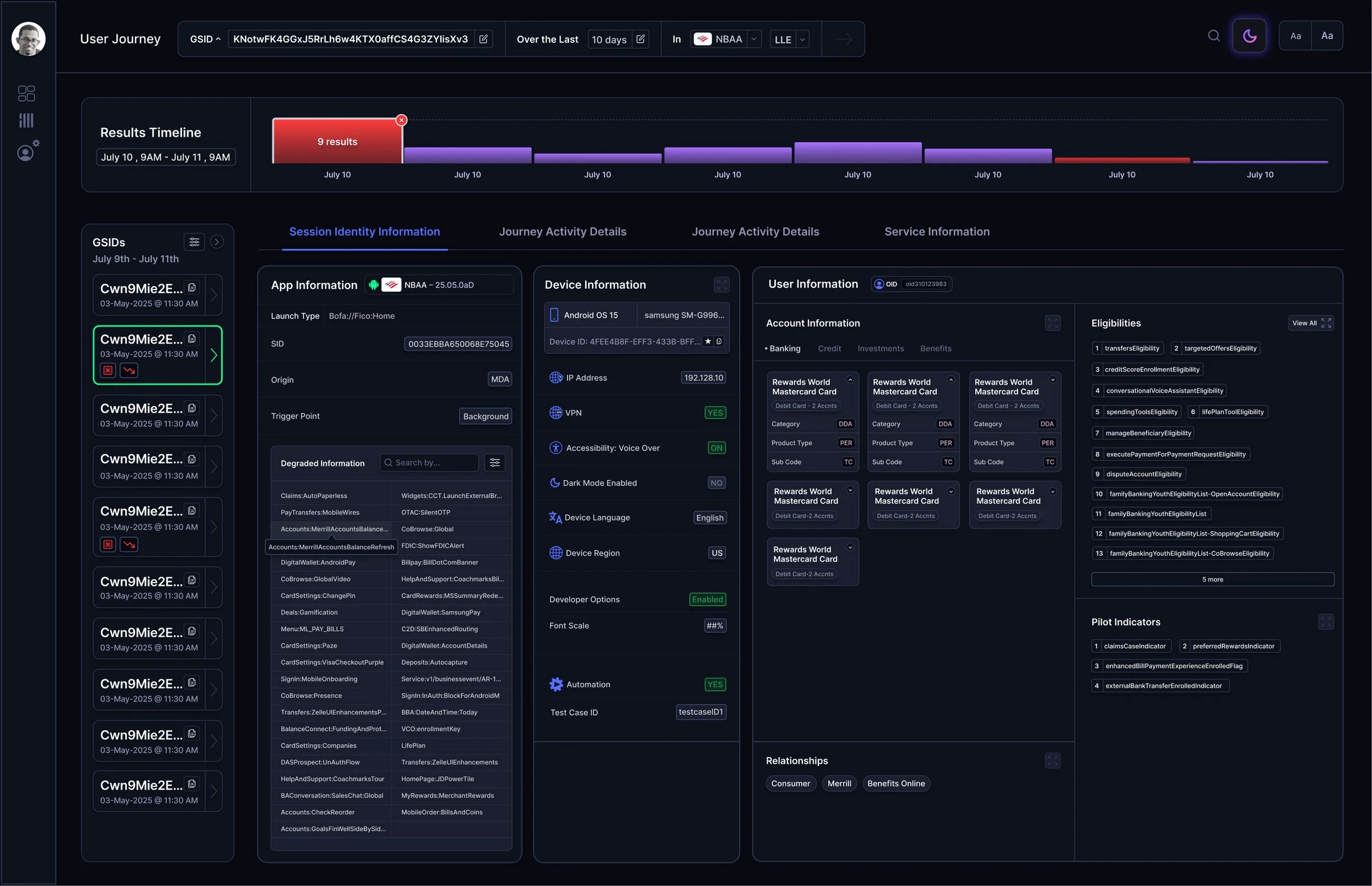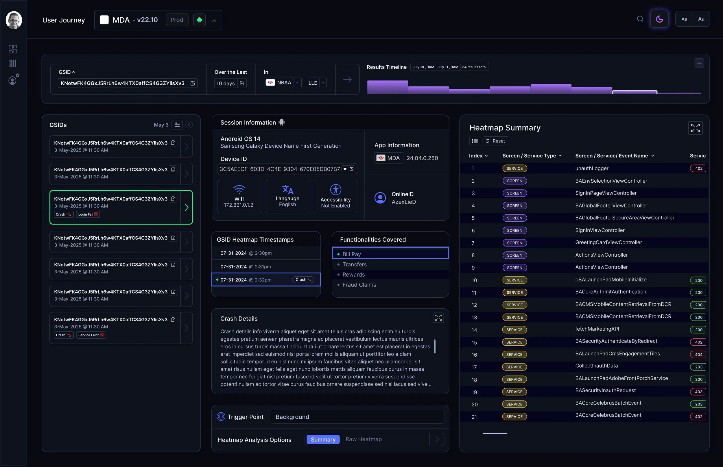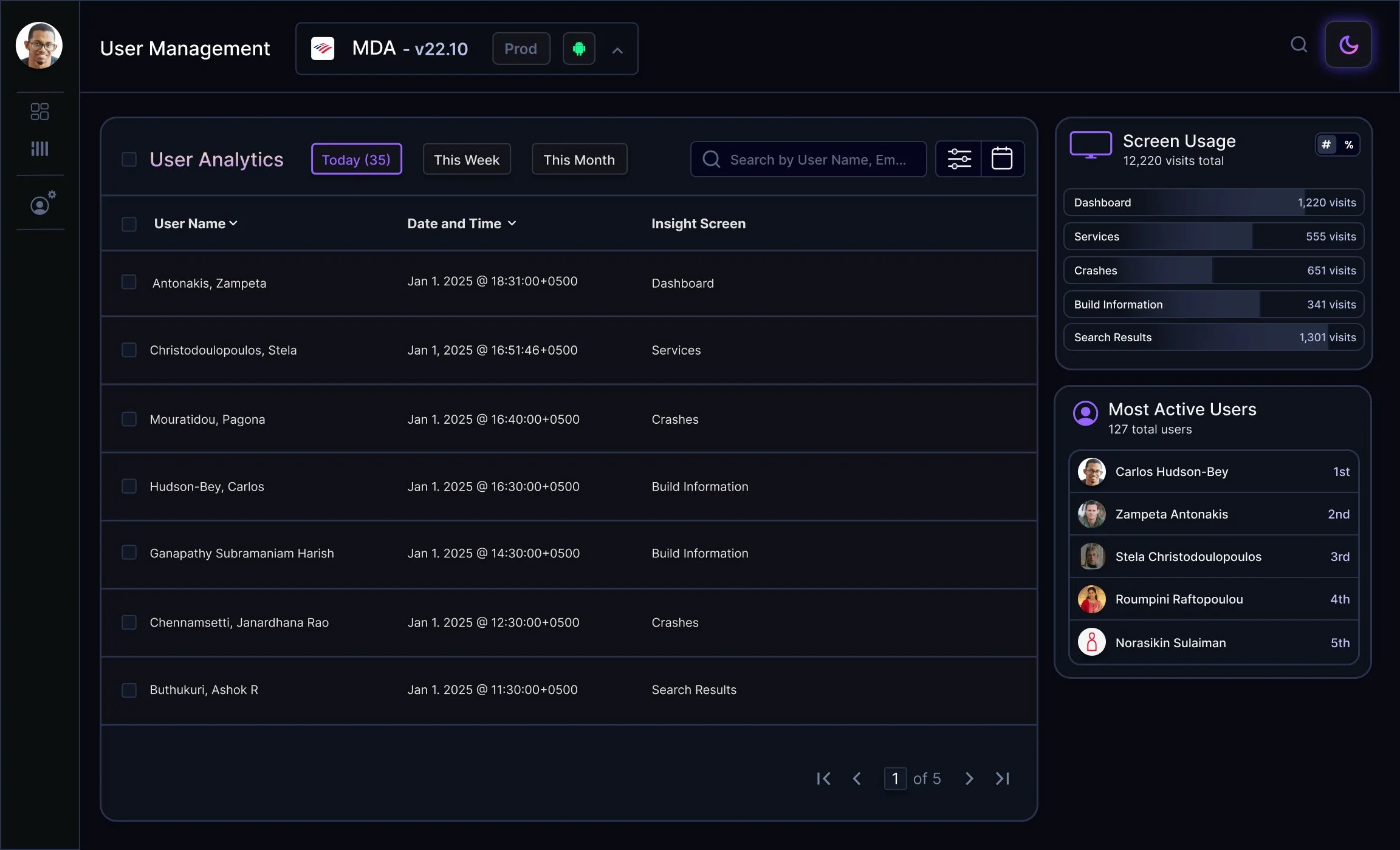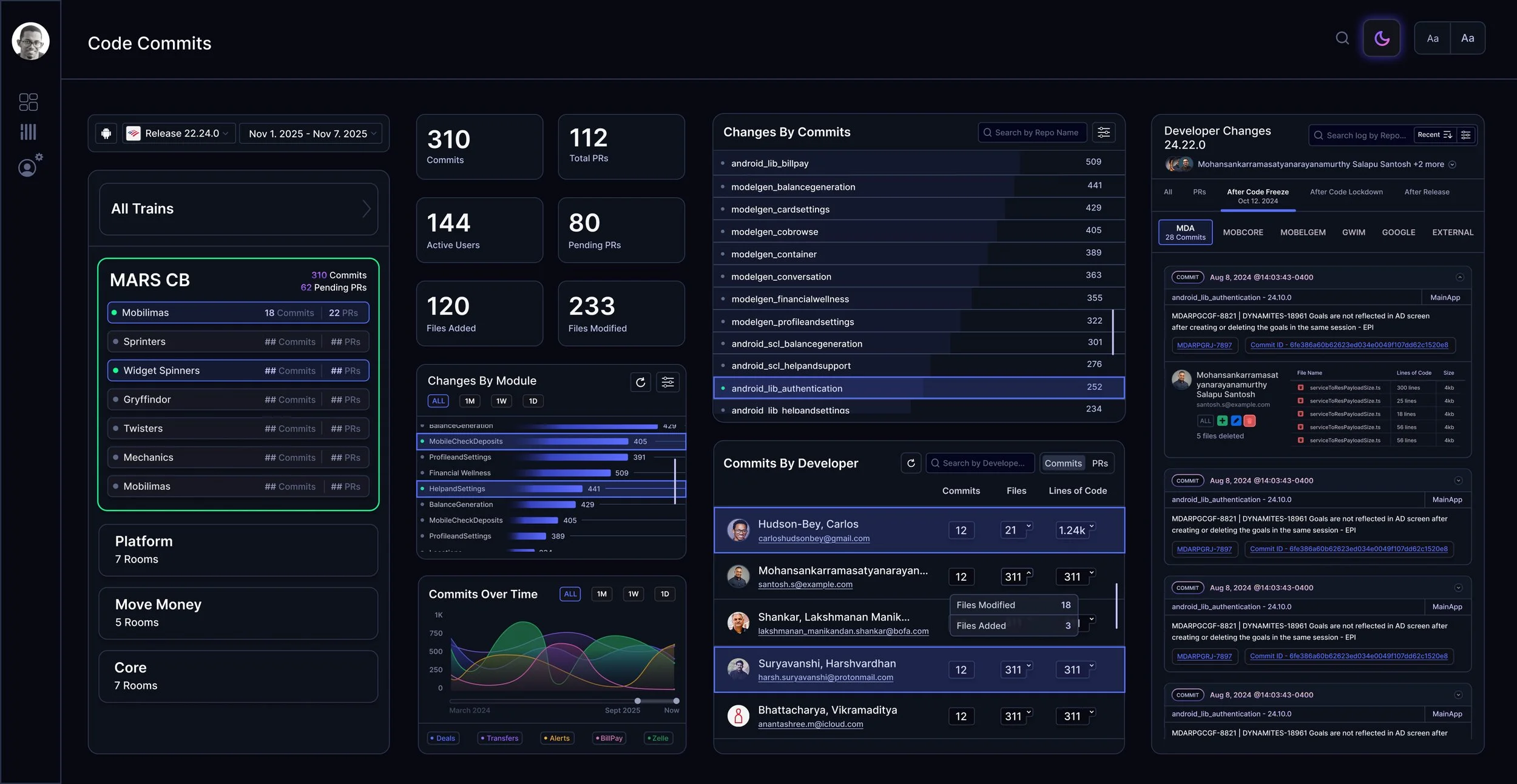
What is Mobile Insights?
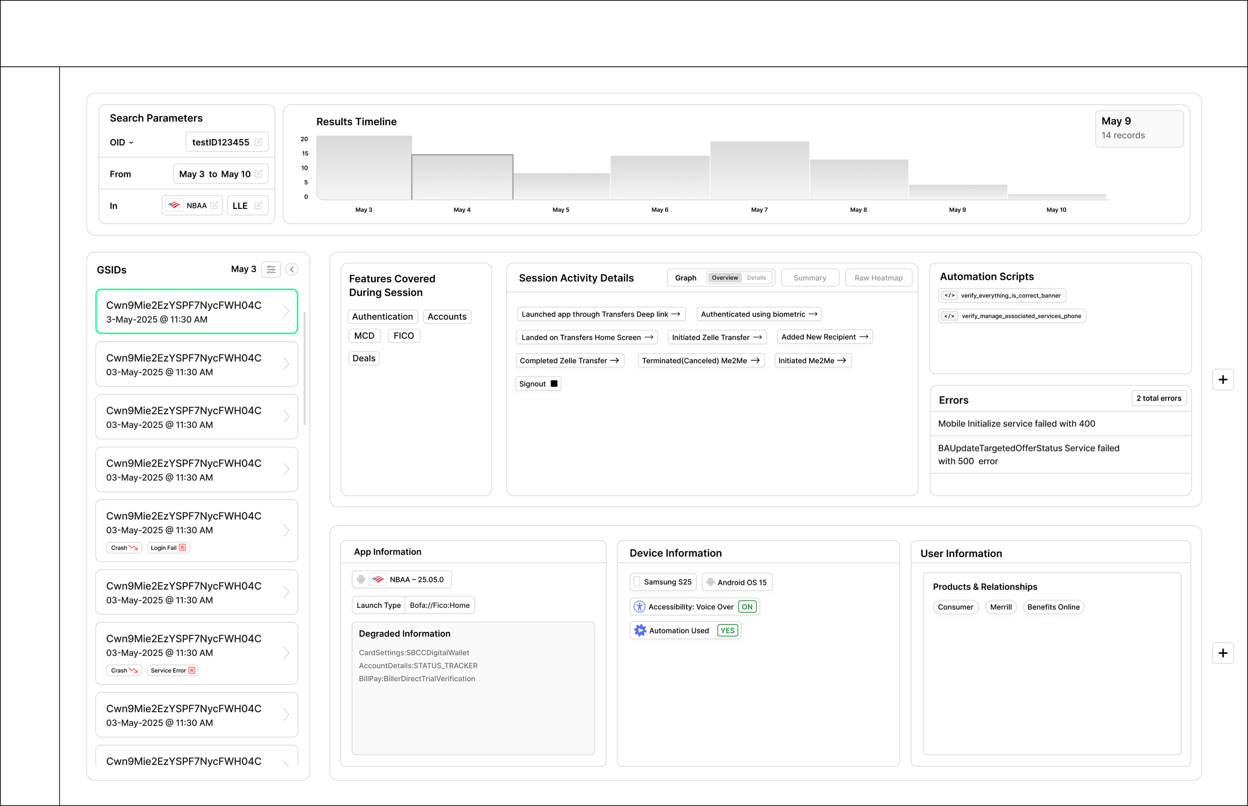
Mobile Insights is a browser based analytics platform that collects comprehensive data across the entire suite of Bank of America’s consumer facing apps. Mobile Insights displays server performance metrics, user behaviors, QA automation tracking, engineering metrics, and system events such as crashes and failures. The platform is used for leadership reporting and operational visibility.
My Role & Responsibilities
As the sole UX Designer on this project, I’m responsible for shaping the end‑to‑end user experience of Mobile Insights. My role spans requirement clarification, exploratory UX work, visual design, prototyping, and direct collaboration with front‑end developers throughout implementation.
Working With Leadership to Define Requirements
Feature requests come directly from my team lead and his superior. Depending on the complexity of the initiative, we’ll conduct whiteboarding sessions where we:
unpack the user and technical requirements
clarify which data types and states need to be represented
identify functional dependencies
begin sketching the structural direction of the UI
During these sessions, I often create grouped and faceted requirement lists, or quick sketch explorations, to ensure we have a complete understanding of what the feature needs to support. These early artifacts help us align before design work formally begins.
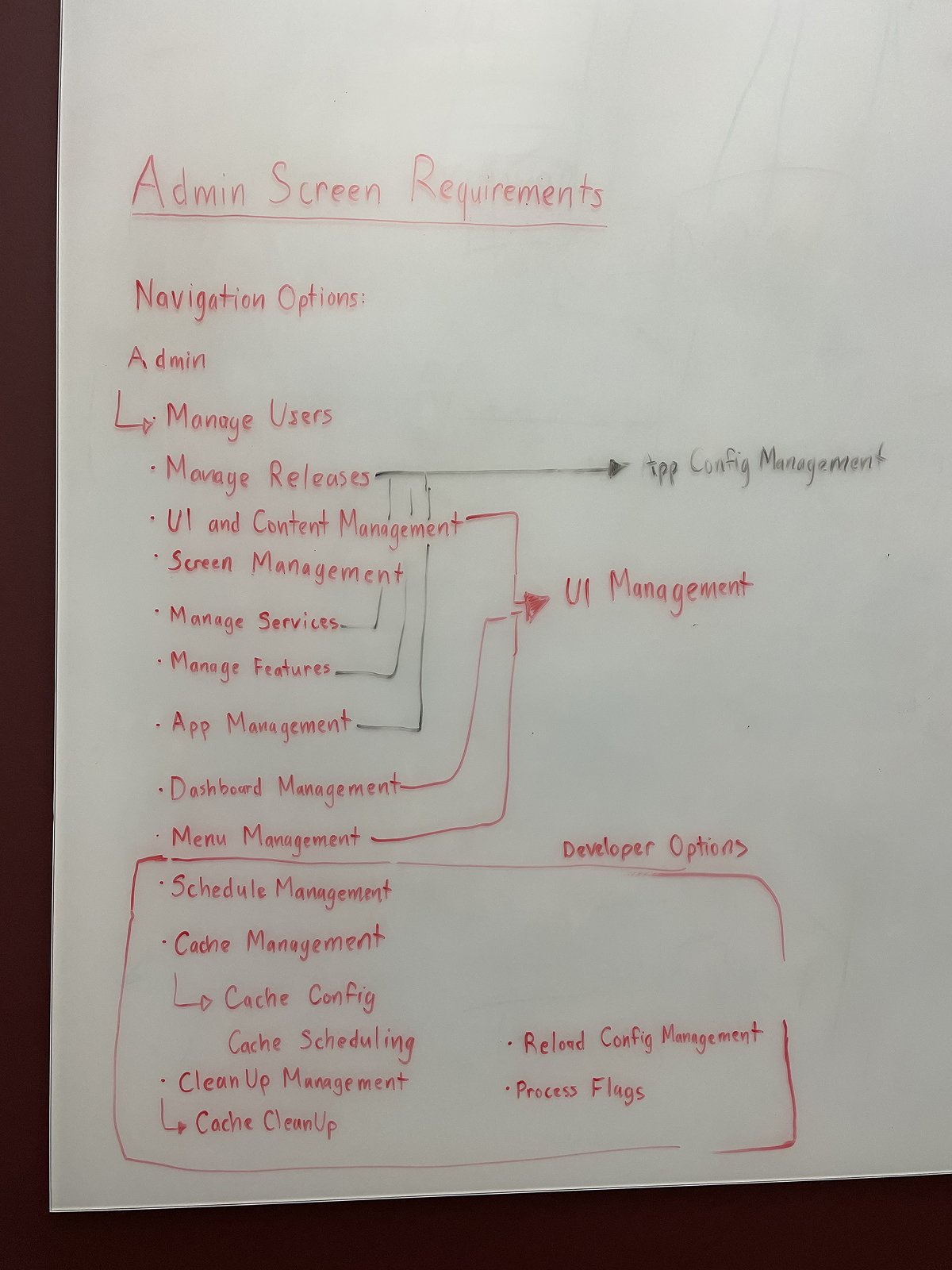
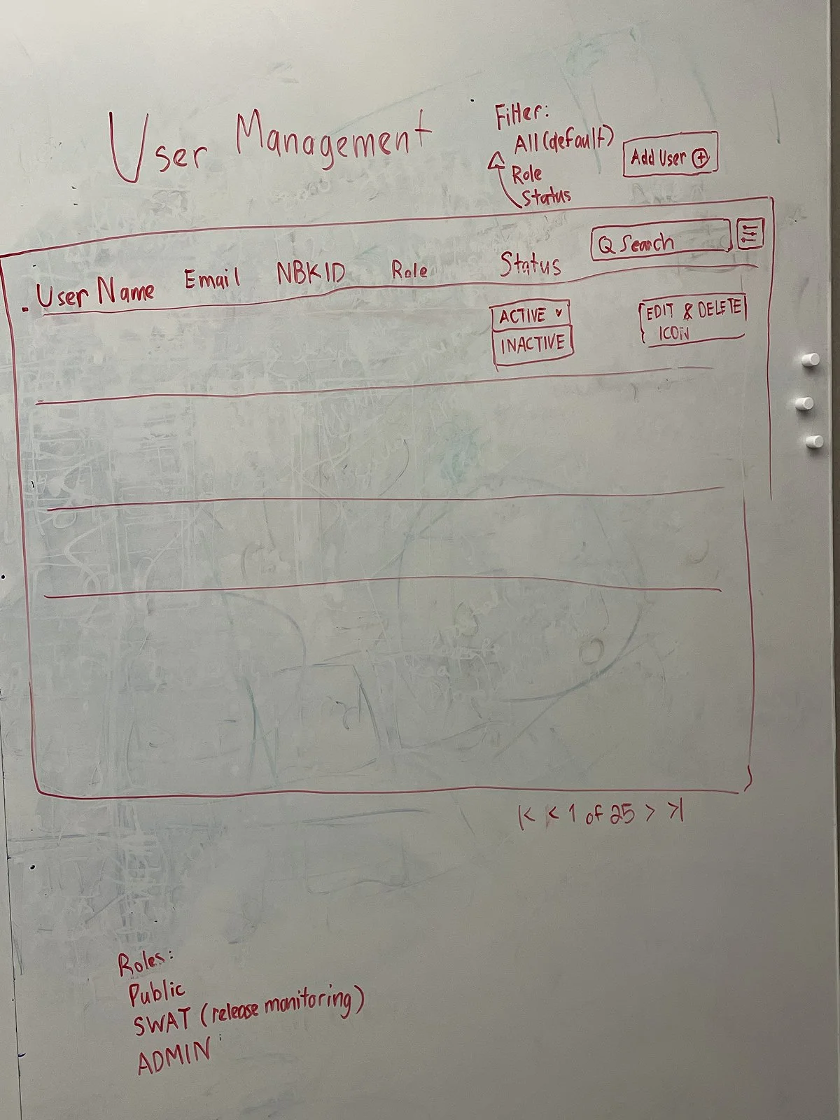
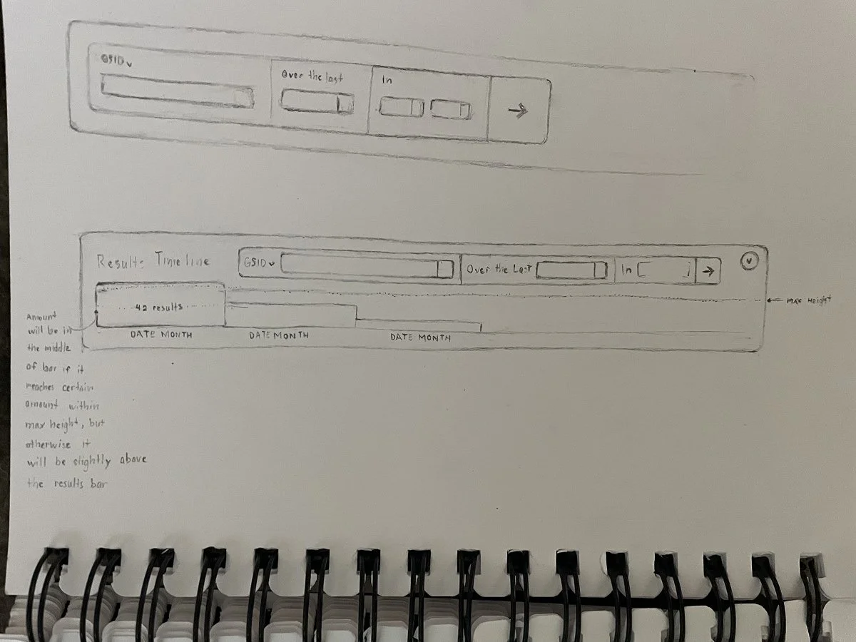
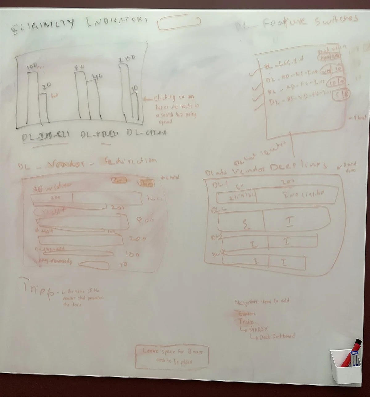
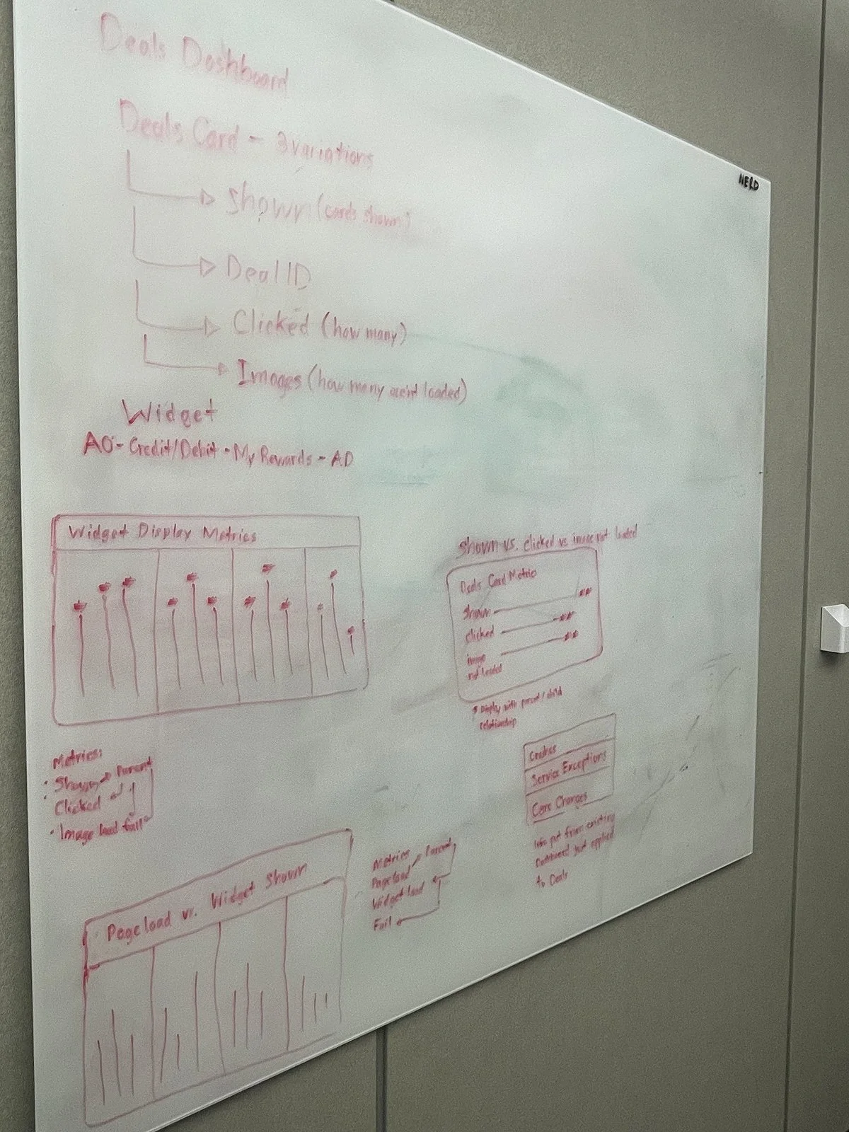
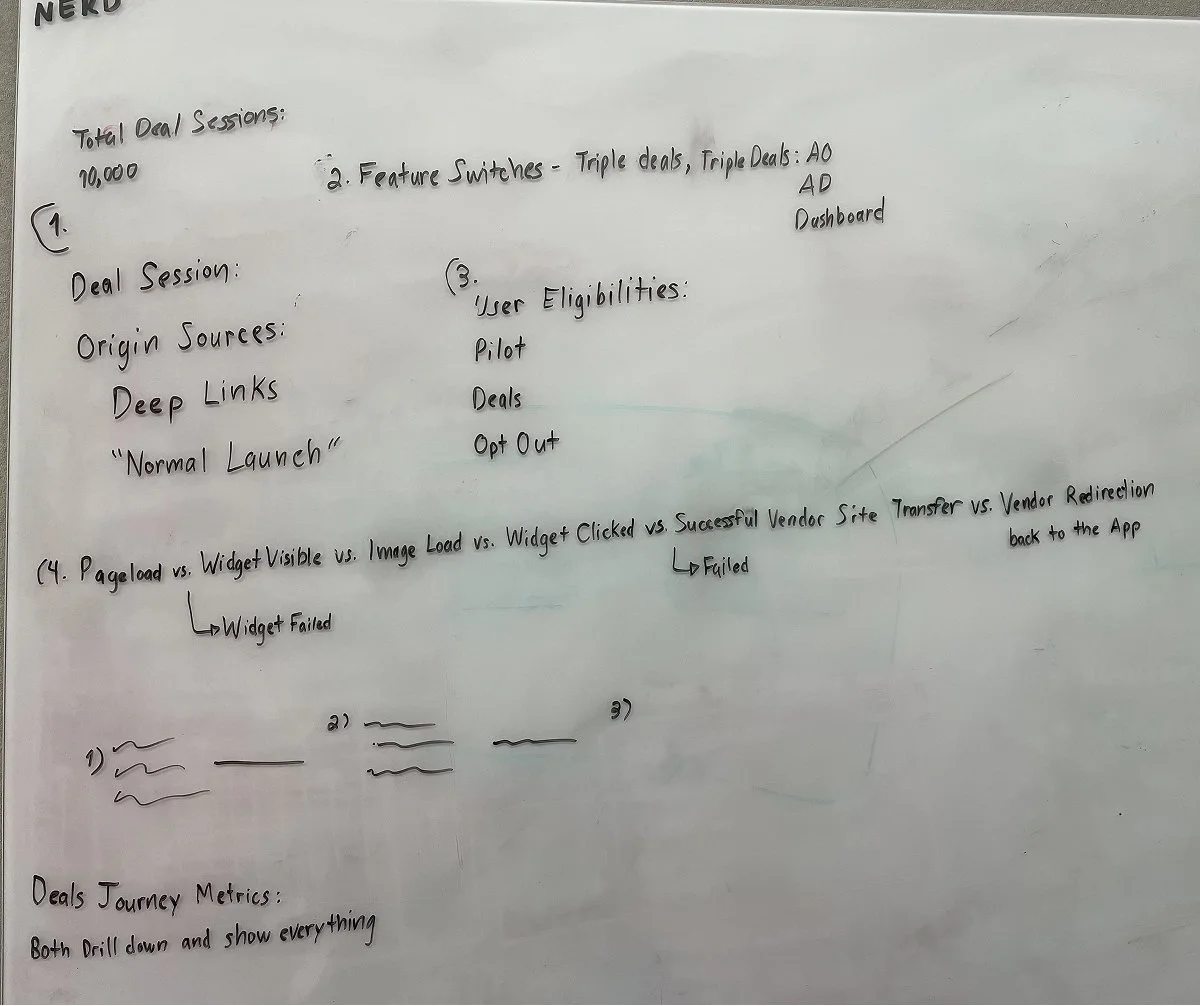
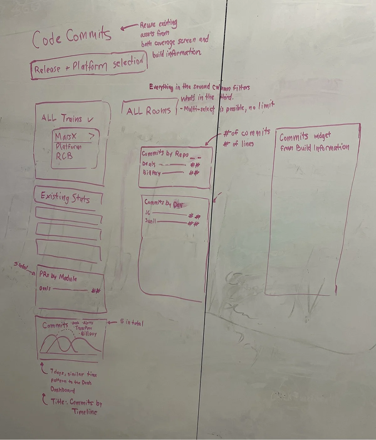
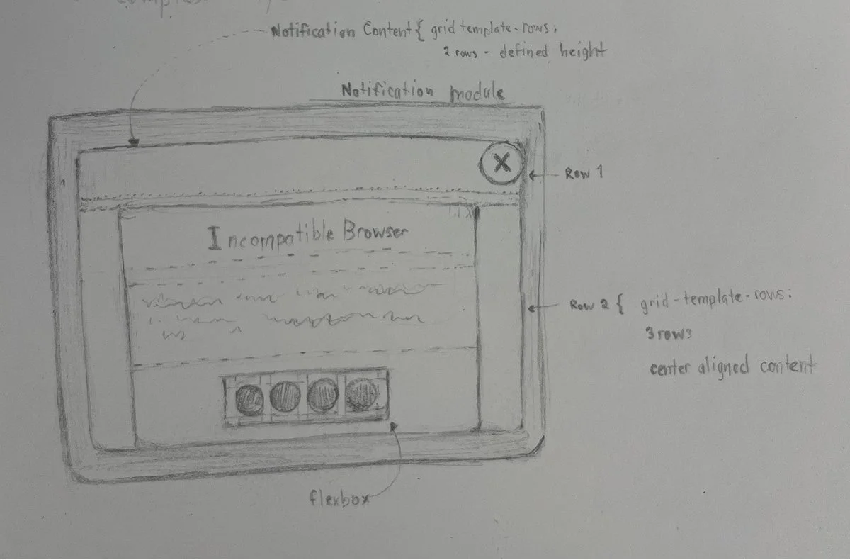
Feature Sketches and Ideation Notes
Concepting and Wireframing in Figma
After the requirements are defined, I translate our discussions into mockups that how show the things will work. I will often create variations and options for my superiors to choose from as I often discover new constraints or form new questions when I start designing.
I typically produce the first iteration of designs within 1–3 days, depending on the feature’s scope and data density. All components use Figma’s variable and token system, which ensures consistent theming, seamless light/dark mode support, and minimal redesign effort across modules.
Because of our established design language, many new features build on existing patterns—but when new challenges arise, I evolve the system in a deliberately and scalably.
Iterative Review and Design Refinement
I share designs during:
morning standups
async Teams/Email updates
live walkthroughs
I track all feedback directly in Figma using:
in-design comment threads
iteration‑labeled screens
snapshot comparisons to explain changes
This makes the review cycle transparent and efficient.
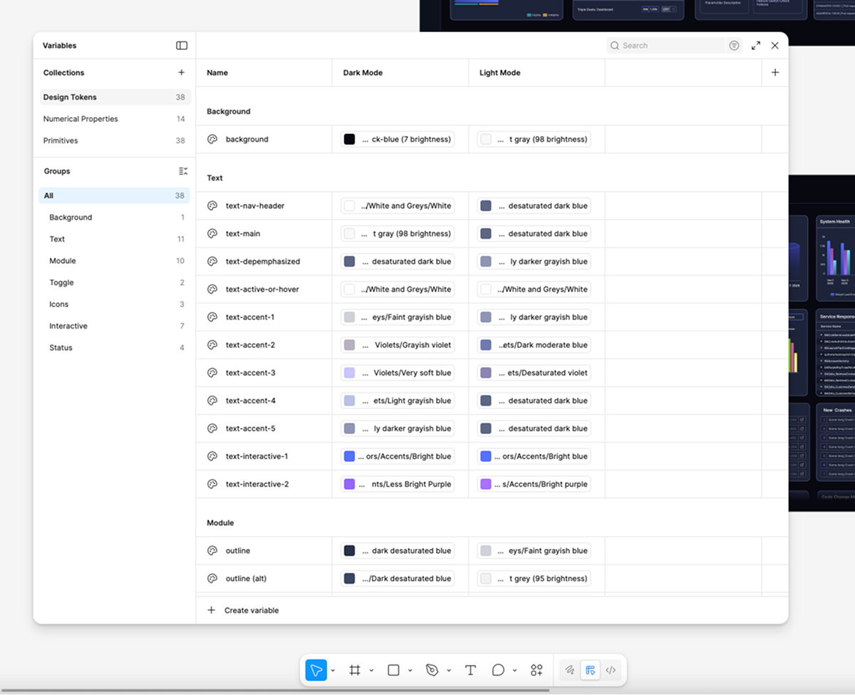
Variables and Tokens In Figma
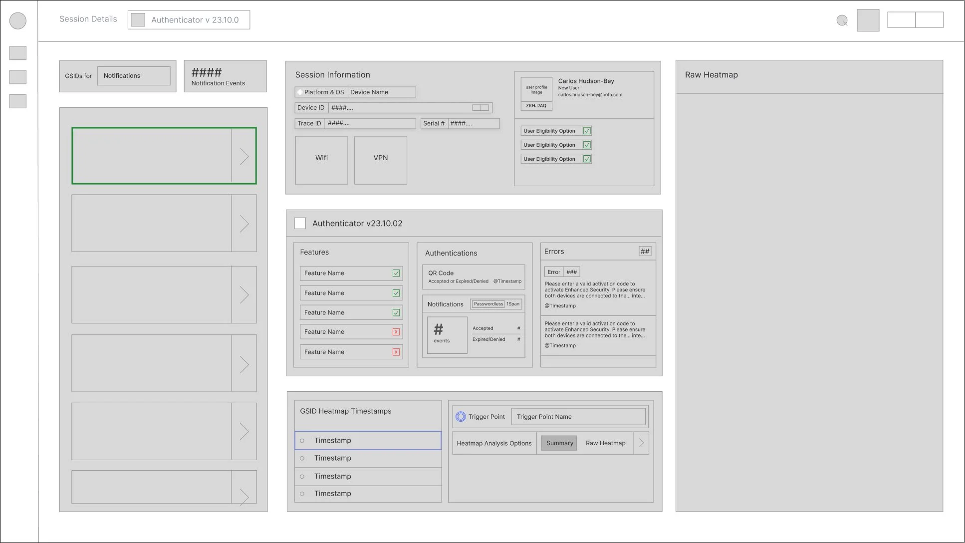
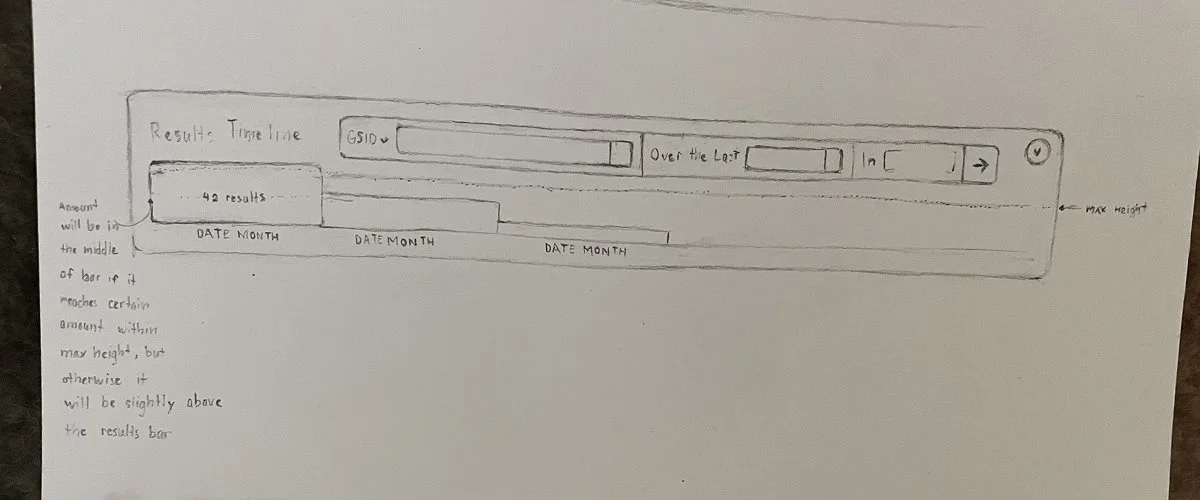
Wireframe Example
Low Fidelity Mock-Up Example
Developer Handoff & Post‑Implementation QA
During handoff, I provide developers with:
reusable components
annotated interaction details
color and typography tokens
variants for different data states
Once features are implemented in staging, I conduct design QA, reviewing:
spacing
alignment
grid structure
component behavior
visual fidelity
While developers handle the majority of the functional implementation, I occasionally contribute minor CSS refinements—tightening spacing, correcting alignment, or adjusting grid layout, fixing colors, and —so the final product matches the intended polish.